
Written by Morten Jerven, Associate Professor, Noragric
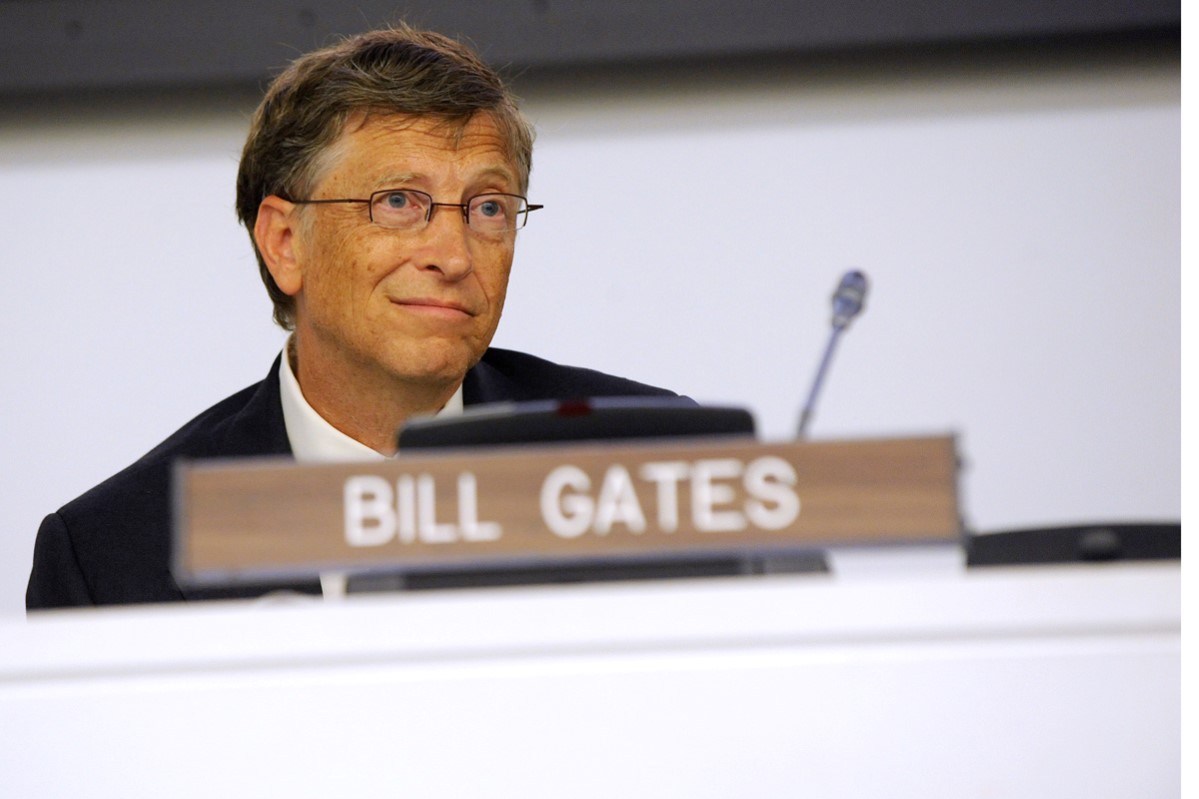
When I’m in the same room as Bill Gates, the average wealth is very high – but that doesn’t help me.
The year 2015 was the best year ever for the average human being, wrote Charles Kenny in the magazine Atlantic. ‘Average human being’. Kenny gives us an excellent example of why it is misleading to report averages. When I’m in the same room as Bill Gates, the average wealth is very high – but that doesn’t help me.
“So far, so good,” said the man who shot past floors 191 and 192 of the Empire State Building after jumping from the top. Those focused only on how fast things are happening will miss out on the big picture; it is important to know where you’re heading – and getting there quickly is not always a good thing.
Kenny, like Steven Pinker before him, points out that, on average, considerably fewer people are killed per year. True – if you ignore the recent conflict in Syria. The number of casualties of war per year in the 20th century starts on a high plateau with the first and second world wars, then it evens out before plummeting (with the exception of the wars in Korea, Vietnam, Iran and Iraq). When one is presented with these averages, it is difficult to disagree that there is a tendency for things to get better. Difficult – but not impossible. This example is based on one specific linear view of history. The Greeks had a circular view of history, where we went from a bronze age to a golden age before civilization perished, and then gradually reemerged. Human lives go from childhood into old age; it would be misrepresentative to use information on growth during puberty to form a picture of the relationship between time and growth in the human body.
Mathematician Nassim Nicholas Tale has fiercely attacked the logic of using past averages to predict the future. He points out that people fail to distinguish between the possibility that something may go wrong and the repercussions if something actually does go wrong. In 2008, we might have looked back and reasoned that we are now much more effective at managing our finances since they have not properly screwed up since 1929. With each passing year it seems that the risks associated with putting all of our eggs in one basket is lower – but this is not the case.
An article in the Wall Street Journal reported that more people in the U.S. die from falling from ladders than as a result of terrorist attacks. True enough, but it is a meaningless comparison. It is impossible for more than a few hundred people to fall down from ladders in the course of one year. There is, however, a small chance that millions of people could lose their lives in one blast of a dirty bomb. These are completely different phenomena.
An historical example is only instructive when it can be applied to the future. Historical figures on the number of deaths from ladder falls may provide a reasonably reliable indication of deaths due to ladder falls the following year. But the number of deaths due to terrorist attacks the previous year gives little information to predict how many will die due to terrorist attacks the following year. In the world we live in, small changes in the environment or specific biological events can decimate human populations.
But in popular science, such slack reasoning takes centre stage. Where one could previously quote Albert Einstein or Mark Twain to give a false impression of intellectual depth, it is now graphs, maps with different colours and multi-sized balloons that provide the facade. Hans Rosling is a particular fan of this method.
The general consensus seems to be that things are now better, on average. The fact is that for most of the life quality factors for which we have data series, we see an improvement, on average, over time. This is more a result of technological advances in healthcare. It may be the case that too little newspaper headline space is used to celebrate this average progress. But Pinker, Kenny, Rosling and the others telling us that everything is now, on average, so much better than before, is oversimplifying the reality. Many of the bubbles in Roslings diagrams are just that – bubbles. If one probes the actual data that quantify the standard of living in many of the poorest countries, the bubbles burst; it turns out that the bubbles are based on zero knowledge.
The general point is that reporting these figures gives about as much insight as reading a thermometer: the figure on the thermometer is useful on its own, but gives us little insight into what makes good or bad weather. Without a theory that can indicate why a tendency is occurring, the information from the thermometer gives the impression that we know more about the wind of change than we really do.
Also published in Norwegian in Bistandsaktuelt and Klassekampen.
Translated into English by Jayne Lambrou.


Permalink
This reminds me that long after the barometer became popular in England (late 17th c.) people were still using a host of other indicators, rules of thumb, and back-tracking patterns to predict weather:
the hooping of Owls, the flying of gnats, flies, or “bat mice”, the setting of sun and the faze of the moon, the progression of previous seasons.
“Any of these, or the like Signs, hap∣pening in the Summer time, will, if the Baroscope concur, help you to make the more certain Guess at what Weather will after ensue, especially if the Glass be at Changeable and Uncertain, for then, by these you may the better guess at what Weather will follow.” (John Smith, 1694- http://quod.lib.umich.edu/e/eebo/A60473.0001.001/1:7?rgn=div1;view=fulltext , p. 83- passim).
In other words, the barometer was about as useful as the theoretical framework in which it was introduced.